
Blog
Tips and Information.
Feature Article
What is a Mobile Friendly or Responsive Web Site?
What is responsive web design, and why is it beneficial to my business?
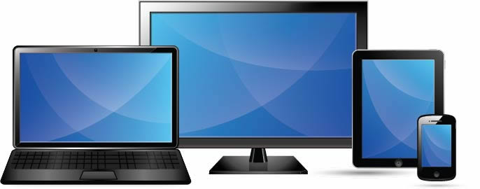
Responsive web design means that a website has been developed so that the same code is used whether the user is on a desktop computer, tablet, or mobile phone - but it can detect the size of your screen and adjust the display accordingly.
What is the benefit of a responsive web site?
- •You only need to maintain one version of the website, rather than one desktop version and one specifically designed for mobile devices.
- • Responsive design is Google's recommended design pattern and does factor into their ranking algorithms, so if you want to improve your search engine ranking, having a responsive site is a definite advantage.
What is an example of a responsive web site?
This site is responsive. If you look at www.digitalrose.ca on a desktop, a tablet and a cell phone, you will see slight changes to the design. All the information appears on each device, but it is layed out slightly differently so that it is easy to read on each device. Image sizes adjust automatically, a section might appear below rather than beside another section, and a menu might change from a horizontal layout to a vertical, touch activated one, so the user does not have to zoom to read the text. These are just a few examples of how responsive design makes for a more pleasing experience for your site visitor.
Search
Share This Article on ...
Recent Articles
Scams, Scammers and Phishing, Oh My.
Wordpress: Build It Yourself, or Ask For Help?